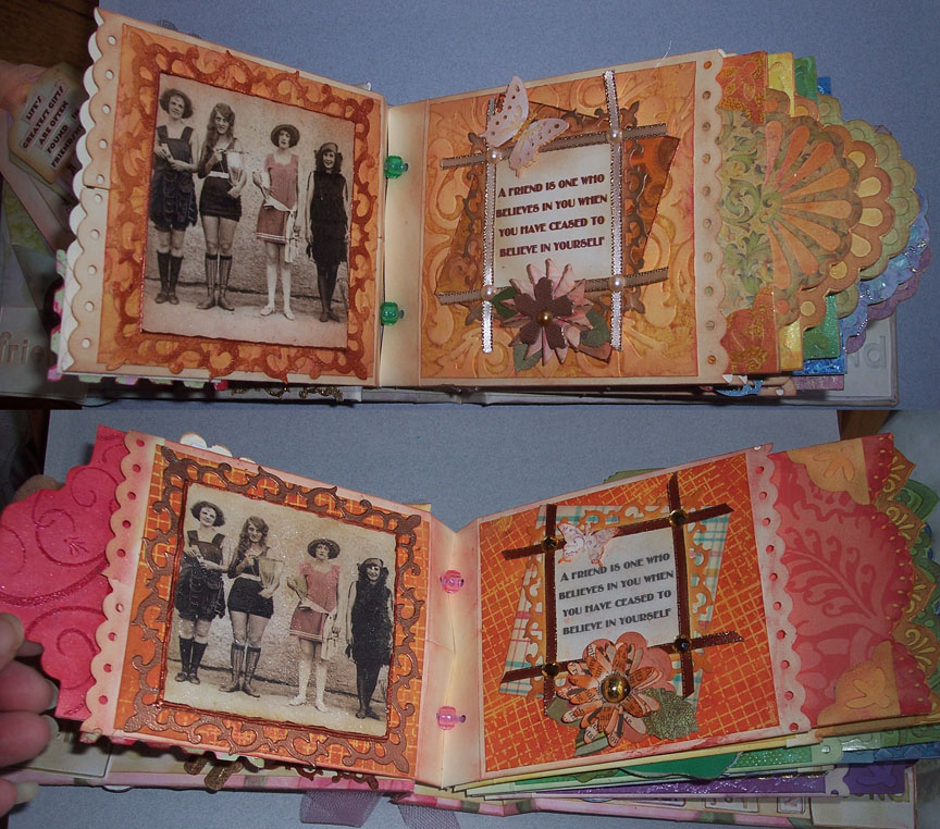
I have two very dear friends who are always there for me to lend support, an artistic eye, and general joy. I made them each a Friendship picture book and storage box for a gift. I used some vintage pictures, favorite quotes and added photographs. I changed the colorways and some of the embellishement techniques so each book wouldn't be the same. I used some of the wonderful fabric I received from Hoffman to cover the boxes. I used lots of embossing powders, Stamps, Crackle paint, inks, stains, gilder's paste and mica powders. also lots of dry embossing and border punches. The binding technique was adapted from a book designed by Laura Dennison of
http://followingthepapertrail.blogspot.com/ Here are some pics.
 |
| Front covers |
 |
| Inside front covers, page 1 |
 |
| Pages 2-3 |
 |
| Pages 4-5 |
The labels on the covers were texturized with Ranger gold and silver UTEE then some color was added with Gilders Paste. The tiles are Tim Holtz Fragments with pictures of various ArtBra projects adhered with Perfect Pearls. The pages were colored with Distress Inks as were the insets. Used lots of Ranger Perfect Pearls, Dimensional Pearls and paint dabbers on the frames throughout the books.
The upper frame of the the yellow pages was made from Sizzix alterations strip die cut from cardstock covered with foil and colored with Gold Alcohol ink. The bottom yellow saying page has Sizzix alterations on the edge Iron Gate embossed with Gold and Bronze UTEE then some black gilders paste. I really like layering the UTEE on to get a really thick coat with lots of texture that is enhanced with the gilders paste.
 |
| Pages 6-7 |
the green pages have one of my favorite pictures and sayings (by Albert Camu). the small flowers are cut from vellum stained with Distress stain. The wings have crystal stickles on them. the upper frame is embossed with Ranger Verdigris - another favorite product especially applied over copper Paint dabber. The hand on the blue pages is from a Cuttlebug die that embosses and cuts.
 |
| Pages 8-9 |
 |
| Pages 10-11 |
 |
| pages 12 and inside back cover |
 |
| Back covers |
<><><><>
The frames around the ladies are braid covered with Ranger Glossy Accents. All the insert pages started out solid colors then were stamped with Stampers Anonymous (Tim Holtz) Music, or flourish stamps, clear EP, then colored with distress inks.


 I decided I needed music in my studio. I only have an old cassette deck with radio that used to be my son's before he outgrew it - I think we got it for him when he was 10 and he is in his 30's now! At his suggestion I bought an iPod shuffle - figured 500 songs would do me for ever! I have had it less 3 days and already have it almost half full! I love that is so tiny - only 1 1/4" x 1 1/4" and the sound is awesome! I felt though it needed a case so I could wear it like jewelry. I can't wear it or any jewelry around my neck because of my repetitive motion injury and the results of my surgery so a pin would work. I made the case from some fabric paper - http://novasblossoms.blogspot.com/2009/11/working-with-paper.html for more info on the technique. The artist used construction paper and I had been experimenting and used chinese newsprint. The paper was colored with Crayons and Shiva Paint sticks first with stencils, then Ranger Adirondack Ink sprays. The paper is backed with Fusible lightweight interfacing and the front with Fusible web which gives it a shiny finish. This is a prototype but the size is perfect. I can tuck the earphones in it too. The case actually measures 2" x 2" x 3/8". It is on a Chatski pin and the charm is shrink plastic stamped with Tim Holtz hand stamp. Next one will be fabric and beaded I think. the iPod is in a small pocket with a clear plastic window.
 I learned something from making this doll - Make the doll first then the head! I did two heads before I actually made the doll and one was too big (first one in the pic), one too small (last in the pic) and the fabric was pilling and generally misbehaving. Then I modified the shape a bit but it still came out too large and this time with Pimatex (second in the pic). Number 4 still not right - didn't like the eyes or the open mouth (4th in the pic) and again with the bad fabric - I never learn!. Number 5 is now on the doll (it's show in the center of the pic above). The Size is just a but too large (and so are her lips!), but I did more sculpting and if I am going to do that, I need to modify the head shape a bit around the chin. This one is from new stock Southern Belle and it stuffed, colored and sculpted perfectly. Soooooo. She is going to live with this head until I play with the pattern a little more. I thought I would share her 5 heads. (I have been known to make more than 10 before I got one I liked! Have also only done one. Go figure.) Now I need to finish her jewelry.
 Her name is Forever Bella. I have been watching the movies and reading the books. I am such a sucker for these tpes of movies - like the HP movies and books. I wanted to try some new products to color the fabrics which all started life as white or pale grey except the blue lace on her jacket. I used three colors of Ranger Alcolhol Inks. They colored the fabrics perfectly and they dry very quickly. I also used multiple colors of Ranger Stickles on her bodice and arms - also fast drying. Her legs were colored with Perfect Pearls Mica powders and then she was given a pair of glitter tulle stockings. I also used the inks on the trims. Working on another version but not from Twilight.
 I also created inserts for each page of the books. The pages measure about 4.5 x 6.5" so a 4x 6 photo would slide in perfectly. The front side of the insert I used patterned paper that I altered with inks and cut the tops with various MS and EK Success punches. The backs were all done with Stamps, Ranger clear embossing powder (I found with experimentation it is the finest and sticks the best for my purposes) and inks. The top tags which are muted colors are for the green book, the bottom tags are for the pink/orange book
 Inside the boxes are printed cardstock that just blended perfectly. I constructed the boxes from chipboard and adhered the fabric with glue just on the wrapped corners, bottom and inside where it is wrapped. I wanted to make sure no glue showed through. The papers on the inside were adhered with Tacky glue. I would have used Gel Medium or Yes paste, but it doesn't have the permenance of adhering paper to fabric as I would like. I also treated the inside cover the same.